.png)
How The Handmaids Tale Marketing Turns Dystopia Into a Powerful Public Message
A red cloak and a white bonnet can now say more than a paragraph of copy. That is the strange achievement of The Handmaid’s Tale marketing: it turns a fictional uniform into a public symbol of control, resistance, fear, and warning.
Margaret Atwood’s 1985 novel was never only a story about a future theocracy. It was a study of how power uses language, ritual, surveillance, and women’s bodies to make oppression look ordinary. The marketing for the Hulu adaptation understood that clearly. Its strongest campaigns did not sell the series as simple prestige drama. They treated Gilead as a visual and political language.
That choice made the show unusually visible. Posters, trailers, experiential stunts, and social campaigns all borrowed from the novel’s core themes. At their best, they turned promotion into commentary. At their most controversial, they also raised a sharp question: what happens when dystopia becomes a marketable aesthetic?

The marketing starts with the novel’s strongest symbol
The most effective marketing for The Handmaid’s Tale begins with reduction. One color. One garment. One posture.
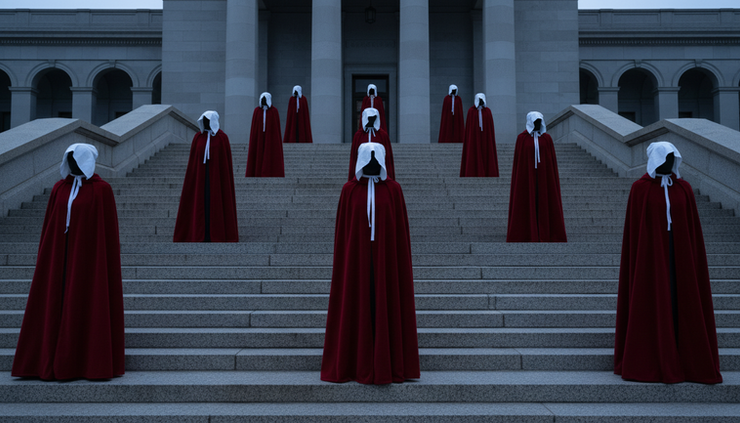
The handmaids’ uniform is easy to recognize because it has a clear visual logic. The red cloak signals fertility, danger, shame, blood, and forced visibility. The white bonnet restricts sight and cuts the wearer off from the world. Together, they make the body public while limiting the person inside it.
That is exactly how Gilead works in the novel. It does not only punish. It stages punishment. It does not only control women. It turns control into ceremony.
This made the costume a powerful marketing device. Early promotional images for the Hulu series often placed June, played by Elisabeth Moss, in the red cloak against drained, gray surroundings. The contrast did most of the work. No long explanation was needed. The image said that the world had narrowed, that the person at its center was watched, and that the color red carried both danger and resistance.
The key art also drew from a familiar visual tradition in dystopian fiction: the isolated figure. A single person stands against a system too large to see. In The Handmaid’s Tale, that isolation feels even sharper because the uniform erases identity. The viewer sees June and also sees every handmaid.
That double meaning gives the marketing unusual force. It promotes one character while suggesting a whole class of people trapped by law, religion, and ritual. The poster becomes more than a character image. It becomes a diagram of power.
Slogans turn Gilead’s language against itself
Language is one of the novel’s most disturbing tools. Gilead uses phrases that sound pious, calm, and communal while hiding violence underneath. Greetings such as “Under His Eye” and ritual phrases around fertility show how authoritarian systems drain words of ordinary meaning.
The marketing leaned into this tension. Short lines in trailers, posters, and social captions often echoed the novel’s vocabulary of obedience and surveillance. The effect was chilling because the words sounded almost harmless until paired with images of confinement.
A strong example is the way campaigns used phrases like “Blessed be the fight,” a twist that turns Gilead’s religious language toward rebellion. The slogan works because it carries two voices at once. It remembers the oppressive speech of the regime, then bends it into defiance.
That strategy reflects one of the book’s central ideas: resistance often begins by reclaiming meaning. June’s narration matters because it preserves private language against public propaganda. She names what Gilead tries to rename. She remembers what the regime tries to erase.
The show’s marketing used that same principle. A slogan could sound like doctrine at first glance, then reveal itself as protest. That made the copy memorable without explaining the entire plot.
The best lines did not describe dystopia. They performed it. They made viewers feel how easily words can become instruments of control.
Public installations made the fiction feel uncomfortably close
One of the most discussed promotional tactics for the Hulu adaptation involved women dressed as handmaids appearing silently in public spaces. These appearances took place around major cultural events and urban settings, where the contrast between everyday life and Gilead’s costume felt deliberate.
The tactic was simple. Red-cloaked figures moved through the real world without breaking character. They did not need signs or speeches. Their silence was the message.
As marketing, it was highly effective because it created a collision between fiction and public space. The handmaids looked wrong in ordinary settings: sidewalks, plazas, event areas, government-adjacent spaces. That wrongness forced people to look twice. It also invited photographs, conversation, and news coverage.
The campaign worked because it understood that the novel’s terror comes from proximity. Gilead is not an alien planet. It is built from familiar institutions, familiar phrases, and familiar political fears. Seeing handmaids in recognizable American places made the story feel less distant.
There is also an ethical complexity here. The same imagery that evokes gendered oppression was used to sell entertainment. Some viewers found the tactic powerful. Others saw it as too close to real suffering, especially as the series premiered during a tense period in US politics around reproductive rights, women’s rights, and democratic norms.
That tension did not weaken the campaign. In many ways, it became part of the campaign’s meaning. The discomfort was the point, but it also carried risk.
Social media turned viewers into interpreters
The social media life of The Handmaid’s Tale extended far beyond official posts. The marketing team supplied recognizable symbols, but audiences carried them into political conversation.
Images of red cloaks became shareable shorthand. Fans, critics, activists, and commentators used them to discuss surveillance, bodily autonomy, religious power, and the erosion of rights. Official accounts could promote trailers and episodes, but the broader public shaped the meaning.
This is where the campaign became unusually modern. It did not depend only on polished ads. It depended on symbolic portability.
The costume was easy to reproduce and easy to understand. Protesters in several places later wore handmaid-style outfits during demonstrations related to reproductive rights and court decisions. These actions were not simply fan behavior. They showed that the marketing image had escaped its commercial frame and entered civic language.
That shift changed public perception of the story. For some, The Handmaid’s Tale became less a dystopian drama than a warning sign. The phrase “this feels like Gilead” entered common commentary because the campaign had made Gilead visually available.
Still, social media also flattened some of the story’s complexity. A single red cloak can stand for many things, but it cannot carry the full weight of Atwood’s world: race, class, complicity, environmental collapse, state violence, and the politics of memory. Viral symbolism works by compression. Literature works by accumulation.
The marketing succeeded because it compressed well. The challenge is that compression can turn a complex novel into a single mood: fear in red.
Trailers sold suspense, but they also sold recognition
Trailers for The Handmaid’s Tale had a difficult task. They needed to attract viewers who knew the novel and viewers who did not. They also needed to introduce a horrifying premise without making it seem exploitative or too abstract.
The strongest trailers used contrast. They moved between glimpses of ordinary life before Gilead and ritualized life inside it. That structure mirrors one of the central shocks of the novel: the world changes step by step, then all at once.
Marketing materials often used familiar domestic images, such as family, streets, institutional buildings, and ceremonies, then distorted them through fear. This made the dystopia legible. Viewers could see that the story was not about a remote future. It was about the fragility of everyday freedoms.
One early high-profile television spot helped position the series as both entertainment and political allegory. It framed the show with urgency rather than distance. The message was clear: this story may be fiction, but its anxieties belong to the present.
That is the core logic of How The Handmaids Tale Marketing Turns Dystopia Into a Powerful Public Message. The campaign did not ask viewers to admire world-building from afar. It asked them to recognize pieces of their own world inside Gilead.
The effectiveness came from restraint. Many of the most memorable materials did not reveal too much plot. They sold atmosphere, threat, and moral stakes. They trusted the image of the handmaid to carry the campaign.
Book covers built the visual grammar before the screen adaptation
The Hulu campaign did not create the novel’s visual identity from nothing. Decades of book design had already taught readers to associate The Handmaid’s Tale with stark contrast, constrained bodies, and symbolic red.
Different editions of the novel have used varied approaches: a cloaked figure, a stylized face, a graphic silhouette, or a more abstract design. Yet many return to the same ideas. The handmaid appears enclosed, watched, reduced, or split between identity and role.
These covers matter because they prepared the audience for the show’s visual world. They also show how adaptable Atwood’s concept is. A strong dystopian image can survive changes in format because the underlying idea remains clear.
The best covers and posters share three qualities:
A limited color palette
Red, black, white, and gray create alarm without visual clutter.
A restricted field of vision
Bonnets, shadows, and framing suggest confinement.
A single human figure
The individual body becomes the site where political power is felt.
That visual grammar helped the adaptation’s marketing feel instantly connected to the source material. It also made the show recognizable in crowded entertainment spaces, where many campaigns compete for attention.

Audience reactions showed the campaign’s unusual cultural reach
The audience response to The Handmaid’s Tale marketing was intense because the campaign arrived at a moment when many viewers already felt political anxiety. The series premiered in 2017, soon after a divisive US presidential election and during renewed national debate over reproductive rights and gender equality.
That timing shaped interpretation. Many viewers did not see Gilead as pure fiction. They saw it as an exaggerated mirror. Critics and commentators often discussed the show alongside real policy debates. Social audiences connected the imagery to contemporary protests. The red cloak became a visual argument.
The marketing gained strength from that context, but it also faced criticism. Some people felt the campaign leaned too heavily on trauma. Others questioned whether the show’s imagery could become fashionable in ways that softened its meaning. A costume designed to represent forced reproductive servitude is not a neutral pop culture object.
Those concerns are valid. Dystopian marketing can easily become aesthetic consumption. A striking image may attract attention while losing the moral seriousness of the story behind it.
Yet the most effective Handmaid’s Tale materials resisted that slide by keeping discomfort visible. The handmaids rarely appeared glamorous in the strongest campaigns. They appeared constrained, watched, or silent. The red was not decoration. It was alarm.
Public perception changed as a result. The story became associated not only with literary adaptation, but with civic warning. That is rare for television marketing. Most campaigns aim for awareness. This one produced a symbol that people could use outside the show.
The campaign’s power comes from moral discomfort
The marketing for The Handmaid’s Tale works because it refuses to make dystopia look distant. It brings the story’s core messages into the mechanics of promotion.
The imagery shows how authoritarian systems control bodies. The slogans reveal how language can hide violence. Public appearances make fictional repression feel present. Social media turns symbols into shared public commentary. Book covers and posters create continuity between literature and screen.
The result is one of the clearest examples of marketing that reflects the meaning of the work it promotes. The campaign does not merely say, “Watch this story.” It says, “Look at what this story is warning you about.”
That approach carries responsibility. When marketing uses images of oppression, it must avoid turning suffering into style. The Handmaid’s Tale campaigns have not always escaped that tension, but their strongest materials understand the difference between spectacle and warning.
The red cloak remains powerful because it is simple, legible, and morally uncomfortable. It asks viewers to notice what systems do to people. It also asks a harder question: how close can fiction get to reality before promotion becomes public message?

A lasting lesson for literature and marketing
The Handmaid’s Tale shows that adaptation marketing can do more than create demand. It can translate a book’s argument into public imagery. The strongest campaigns did not explain Atwood’s themes from a distance. They made viewers feel surveillance, ritual, silence, and control through color, framing, and language.
That is why the marketing remains so memorable. It treated dystopia not as a fantasy world to visit, but as a warning system. The red cloak sold a series, but it also gave the public a symbol for fear, resistance, and vigilance. In that uneasy overlap, the campaign found its real power.



Comments